Tuesday, March 25, 2014
Comment Replies
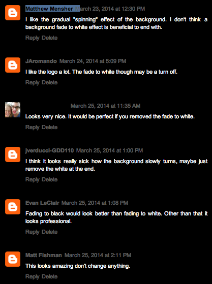
People liked seemed to like the logo and the effects that I added with it. It seemed to be a majority opinion that I should remove the fade to white. Possibly a fading to black effect would appear more professional.
Project 7 - Presentation
Matthew Mensher
-The 'logic' of the sequential build of elements does work, it looks great!
-everything supports the concept, yes
-you could make it a bit slower and less choppy, maybe change the colors and fading
-not much use of transitions, it just happens
-images? no effects? definitely filters? certainly
Looked at Brian Eisenbergs as well, it looks great, everything above the same except his flowed much better.
-The 'logic' of the sequential build of elements does work, it looks great!
-everything supports the concept, yes
-you could make it a bit slower and less choppy, maybe change the colors and fading
-not much use of transitions, it just happens
-images? no effects? definitely filters? certainly
Looked at Brian Eisenbergs as well, it looks great, everything above the same except his flowed much better.
Tuesday, March 18, 2014
Subscribe to:
Posts (Atom)